Deal or No Deal
Rebooting a Game Show

OBJECTIVE
Understanding the Audience
One of America's most popular game shows, with its iconic host Howie Mandel, was returning to television on CNBC, the perfect brand to give the show a major reboot. Working with the creative geniuses at Code & Theory, the team leveraged the same design system behind CNBC.com, Make it, and Warren Buffett Archive to quickly create a fully responsive website that would be video-centric, showcase talent and contestants, and integrate interactive features in addition to a remake of the original online game. It's a clear example of how this new design system accommodates distinct branding and content offerings using the same or similar grid structure and components.
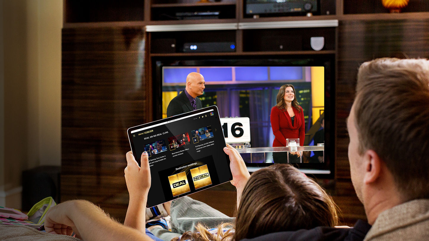
The site was designed with a second screen in mind. Viewers have not only come to expect access to their content and consistent experience across platforms, but they also desire a way to connect to a community and interact with the show.
The new site was the perfect vehicle to support the exclusive behind-the-scenes content and curated "best moments" clips, find out more about the show's host and 20-plus cast members, and watch full episodes. A strong presence on social media was a major part of the strategy to boost viewership but also an opportunity to drive new side-door traffic to the site, broadening the audience reach of CNBC, an overarching business goal for the organization.

RESULTS
Flexibility & Flair
The site was another major departure visually, however structurally, the site utilized the original component system with a few custom additions that enhance the interactive experience and enable show talent to be prominently featured.
Capturing the excitement of the show actually meant exercising design restraint, as the show itself is very colorful and flashy. Video stills and on-set photography would occupy the majority of the screen's real estate. Therefore, the interface around it needed to be more of a lights-out framework with some accents that reflect the dynamic and colorful show stage set.
Again using "Proxima Nova" as the base font with bold weights and variable size shifts to create a visual hierarchy and impact.
The look and feel would understandably match the palette of the show, but it was critical that the digital presence was clearly defined and able to carry over to social channels where the show would be promoted heavily and content extensions explored.
The show unfortunately isn't on air, but you can visit the site through archivedotorg (with patience)
or watch it on Peacock.


